It started as an in-office joke involving a ridiculous blonde mullet wig and two members of staff at odds over the merits of eating chicken, and it ended up as a frantic VR first person shooter in which a retired special agent shoots waves of marauding zombie chickens. In creating Oz Chicken Slayer, we were building on our experience of creating for VR platforms from architectural visualisation projects, but applying it to a fast-paced mobile game that invites you into a comic book world as the titular hero.
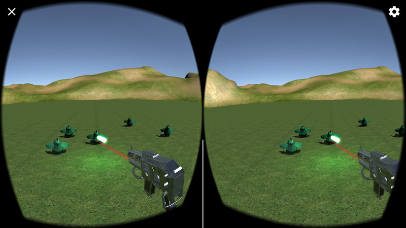 The early version of the game, a hidden easter egg in another project, proved too much fun to abandon…
The Google Daydream is a fantastic new piece of hardware, turning the user’s mobile phone into a VR system, and we were excited to work with it. Developing for VR, particularly on such new hardware did pose some interesting challenges, however. When building in VR environments, game elements that would be trivial to implement in a normal video game can suddenly become unique problems; the user interface in a VR game cannot be a flat overlay on the screen, but instead must be made up of objects placed within the 3D space. The crosshair, which is usually a very easy part of building shooter gameplay, was in this case one of the most difficult things to implement in the game, because it needed to be an object that tracks both the direction of the player’s gaze, and the way they are pointing the controller, while being an object that floats in 3D space at the right distance to feel like a natural, intuitive indicator of where you’re aiming. Our goal was that the player would be able to immediately grasp how to control the game and feel like it responds intuitively to their movements and input.
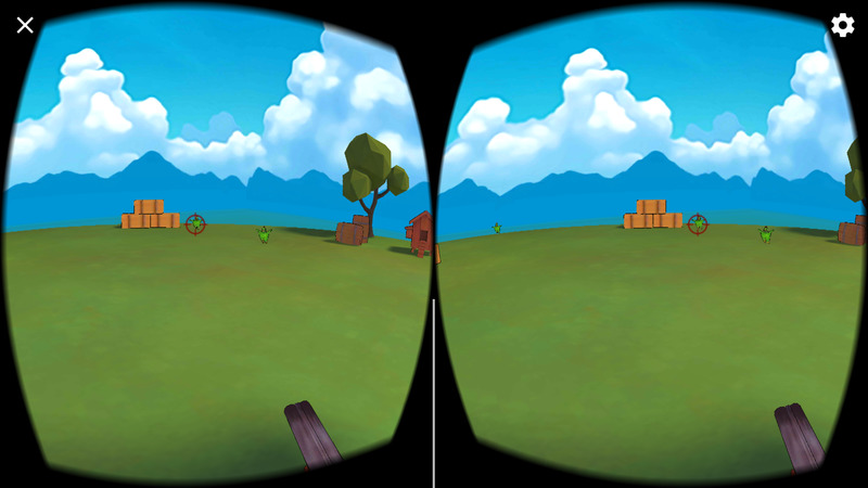 The reticule and shotgun follow where the user points the controller; tricky in 3D space!
The cartoon aesthetic of this project is completely different from the high level of realism seen in our architectural work, but needed to be just as immersive. Our motto when creating the game was; “Let’s do something simple, but do it really well.”
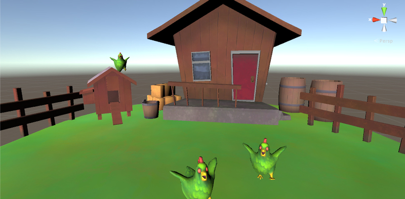 A screenshot during the game’s creation showing the assets have much less personality with a standard shader. The skybox is also absent at this stage.
Each asset was carefully modelled from scratch to achieve the exaggerated cartoon proportions we wanted, complete with painted textures, using a combination of 3D modelling and artistic software. In order to push the comic book appeal of the assets as much as possible, some detail on textures was painted in Clip Studio, a program more commonly used by comic artists, which was also used for the various kinetic illustrations in the opening sequence. Every object in the game uses painterly grunge to minimise visual monotony in the simple environment in an impressionist way. This makes the game distinctly different from most shooters on the mobile VR platform, since rather than aiming for realism, we chose a deliberately stylised approach. After applying a “toon shader”, objects and enemies are rendered with black outlines in realtime, creating the feeling of being inside an illustrated environment.
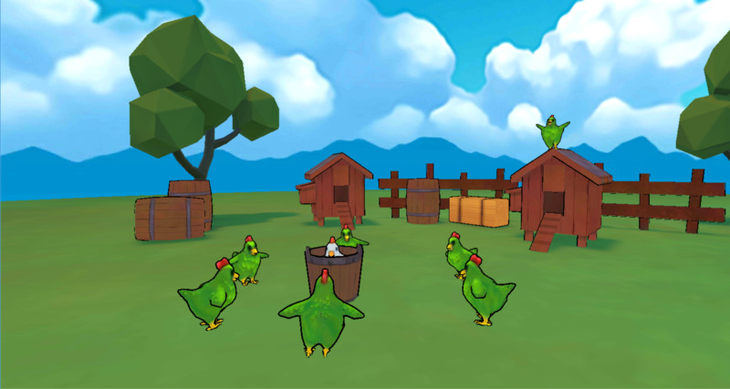 If you look carefully, you can see how every asset has subtle colour variation. Impressionist painting techniques are applicable to zombie chicken slaying.
Oz Chicken Slayer was a blast to work on, allowing our team to solve unique development challenges with a fun end goal and irreverent tone.
