Introduction
Material Design has been around for a few years now, and one of the fundamental aspects of Material Design is motion. Excerpt taken from the Material Design documentation:
Motion shows how an app is organized and what it can do.
- Guided focus between views
- Hints at what will happen if a user completes a gesture
- Hierarchical and spatial relationships between elements
- Distraction from what’s happening behind the scenes (like fetching content or loading the next view)
- Character, polish, and delight
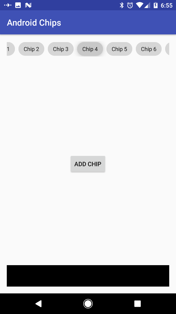
So, to give you a bit of a back story, we are working on a terribly simple, re-usable component, its far too small to be termed library for the basic material design chip. There are some specs to the “chip”, and since we are one of the lucky ones and most of the apps we build are API 21 and over, so I decided to use ViewOutlineProviders to provide the “outline” to the chips.
Ripples and State List Animators, and what does that have to do with Outline Providers
Ripples are an integral part of clicked states in Material Design. Its the (obviously) ripple effect when you touch something.
State List Animators on the other hand as per the docs “Lets you define a number of Animators that will run on the attached View depending on the View’s drawable state. It can be defined in an XML file with the
A StateListAnimator can be used in anger in the following way:
<?xml version="1.0" encoding="utf-8"?>
<LinearLayout
        xmlns:android="http://schemas.android.com/apk/res/android"
        xmlns:app="http://schemas.android.com/apk/res-auto"
        android:layout_width="match_parent"
        android:layout_height="wrap_content"
        android:stateListAnimator="@drawable/lift_on_touch"/>
And this StateListAnimator would comprise of an xml in the drawable folder and could look like this:
<?xml version="1.0" encoding="utf-8"?>
<selector xmlns:android="http://schemas.android.com/apk/res/android">
    <item android:state_pressed="true">
        <set>
            <objectAnimator android:propertyName="translationZ"
                            android:duration="@android:integer/config_shortAnimTime"
                            android:valueTo="10dp"
                            android:valueType="floatType"/>
        </set>
    </item>
    <item android:state_pressed="false">
        <set>
            <objectAnimator android:propertyName="translationZ"
                            android:duration="100"
                            android:valueTo="0dp"
                            android:valueType="floatType"/>
        </set>
    </item>
</selector>
The drawable is placed in, surprise! surprise! the drawable folder. We’ve provided two states, when its pressed and when its not, the behavior of which is quite self explanatory.
View Outline Providers
Now I needed the shape of a chip, and a chip basically is rectangular in shape with round sides(a stadium). Lazy me would essentially have used a shape drawable with rounded sides. Like:
<ripple xmlns:android="http://schemas.android.com/apk/res/android"
        android:color="?android:attr/colorControlHighlight">
    <item android:id="@android:id/mask">
        <shape android:shape="rectangle">
            <solid android:color="#000000" />
            <corners android:radius="16dp" />
        </shape>
    </item>
    <item>

        <shape android:shape="rectangle">
            <corners android:radius="16dp"/>
            <solid android:color="@color/black_16"/>
        </shape>
    </item>
</ripple>
But what this means is I really don’t have a component whose background can be changed while retaining the stadium shape. So what I have now is essentially a component in its essence is just a normal rectangle and I might as well use a button.
So, normally what a dev would do is probably alter the Canvas in the onDraw and clip the Path, now this is unnecessarily complex (I’m sure there would be enough devs to disagree with me on this) with the existence of the ViewOutlineProvider. A custom ViewOutlineProvider you can essentially modify the outline such as clip it, and this also determines the outline for any shadows in the view, allowing the StateListAnimator or elevation to cast the right shaped shadow if desired. Also you could essentially modify the shape of a view using composition over inheritance which in itself is a big win.
So now I do away with the shape’s corners because I no longer need it:
<?xml version="1.0" encoding="utf-8"?>
<ripple xmlns:android="http://schemas.android.com/apk/res/android"
        android:color="?android:attr/colorControlHighlight">
    <item android:id="@android:id/mask">
        <shape android:shape="rectangle">
            <solid android:color="#000000" />
        </shape>
    </item>
    <item>
        <shape android:shape="rectangle">
            <solid android:color="@color/black_16"/>
        </shape>
    </item>
</ripple>
and now I use the ViewOutlineProvider to essentially create a round rectangle.
ViewOutlineProvider viewOutlineProvider = new ViewOutlineProvider() {
    @Override
    public void getOutline(View view, Outline outline) {
        outline.setRoundRect(0, 0, view.getWidth(), view.getHeight(), view.getHeight() / 2);
    }
};
setOutlineProvider(viewOutlineProvider); //Notice I have used inheritance
setClipToOutline(true);
and viola! we’ve got a wonderful stadium shaped chip thats rises on touch, has a beautiful replaceable ripple and casts a shadow that corresponds to the shape of my chip.
Code can be found here in its entirety: https://github.com/Tengio/android-chips